
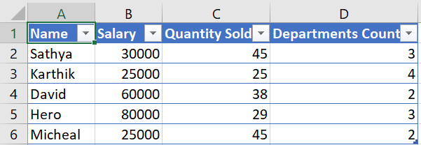
Let us consider taking the below dataset. We currently have employee names of a company who have a salary column, Quantity Sold for items and Departments they work under – Count.
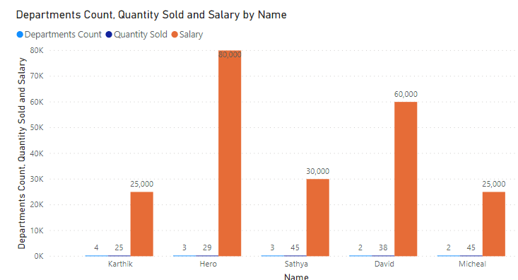
When we place these values into a chart in Power BI we will get something like this.
What if the user wants to view only specific measures? Let’s try creating that now.
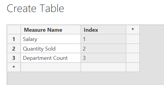
Create a new table and place it with the measure names as shown below. Ensure you create index values for each measure.
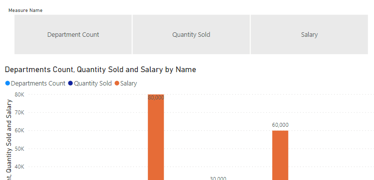
Now let’s drag this as a slicer.
Currently this does nothing. But let’s make the dynamic on demand swap work. For this I will be using the DAX function, SWITCH.
Create a measure with the below DAX inside.
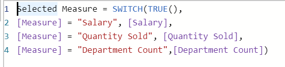
Incase you are not able to get all the measures mapped into the DAX code like above. Don’t worry go ahead and create the measures as Power BI will only call these when invoked and will not impact the performance or make the dashboard heavy. Measure in Power BI are called at ‘Run-Time’.
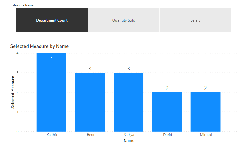
Use this measure in the chart now. You can dynamically start changing the measures in the chart.
Now if you would like to showcase more than one measure. All you need to do is repeat the above process with the measure names added out in a new table.
Create a DAX function that calls the other measures you want, with the selection condition as shown for the previous Measure. But you will now replace it with new key figure names that you would want to show.
